Innovative Eye Pillow Landing Page Animation
Hey buddies!
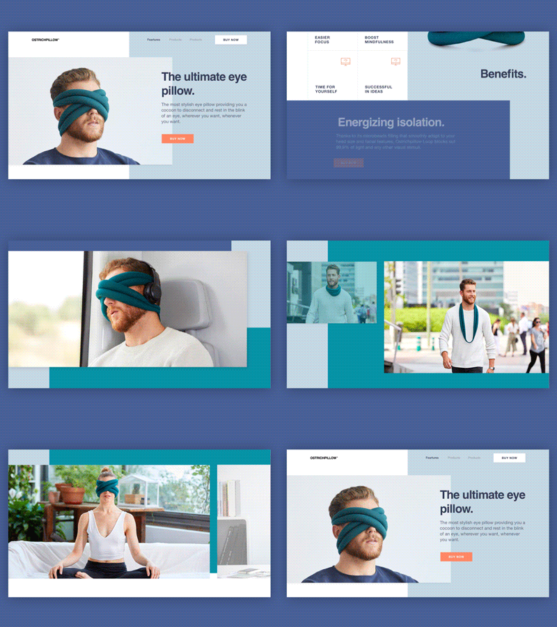
What we’d like to share with you today is the animated version of the landing page design we created here, at Zajno, for a cool company that designs and produces pretty unusual pillows. The coolest thing was that the guys value originality and experiment (which is easy to see in their products), and we were glad to illustrate with our design.
Join our Newsletter for more inspiration!
Goals Coming up with non-standard, unconventional design solutions to create a website dedicated to the company’s new, revolutionary product - Eye Pillow, showcasing all the benefits and advantages of this innovation.
Approach We kept on experimenting with the layout and composition to find some non-trivial solutions that would showcase the product’s rad nature in the best way. To this end, we chose to use demi bold typography together with geometric layout ’cause, in our opinion, it’s the best match to the concept. We animated the page to show you the journey users will have while exploring the product.
Results We ended up with a lively and unconventional website design that adheres to the product’s style and originality and speaks to the target audience. We pretty much enjoyed working on it, wonder what you think of the result. So what do you say? Eager to hear from you!
Press "L" to show some love!
ᗈ Join our Newsletter! ᗈ Website ᗈ TheGrid ᗈ Spotify ᗈ Twitter ᗈ Medium ᗈ Facebook ᗈ Instagram

