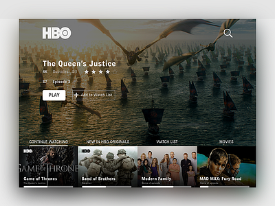
Daily UI #025 TV App
I decided to go to an HBO nerdy stuff interface :) and make a redesign of the on-boarding experience.
I made use of the Multiply effect in the imagery to increase the legibility of the content shown.
Story: According to Rochelle King, from Spotify, a darker interface focuses the attention of the user to the content itself. This conclusion was collected by a design sprint from Spotify.
#dailyui #content
More by Jose Trave Villalba View profile
Like
