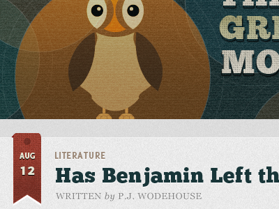
The Great Monologue Revised
Have added some light sources to the header illustration and type. Doesn't feel as "dead" now.
Not sure about ChuckFive typeface for the heading. Lowercase looks sloppy, uppercase is a lot more polished.
More by Maleika E. A. View profile
Like
