Meeting Schedules - Option A or Option B?
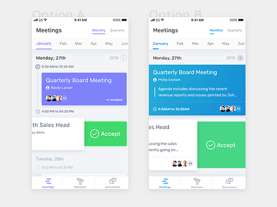
Options A) - Has a timeline view which can be useful for the users to visually scan the schedule from top-to-bottom. The meetings are grouped in form of cards, which are color-coded based on the meeting status. There are four statuses - 1) Upcoming 2) Accepted 3) Rejected 4) Attended.
Option B) Has a simple card view, and the cards are supposed to slide in from the bottom, as the user keeps scrolling. The bigger cards are able to accommodate an additional information (agenda) which was not there in the timeline view.
What do you guys think?
Check out the full pixel! :)
More by 🏅Chandan Mishra View profile
Like
