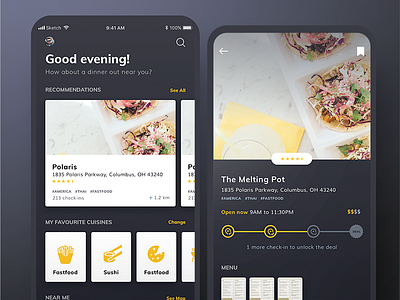
Dark UI Food App
Playing around with a dark UI for a client food app. Working with some less common colours in my pallet - black and yellow! It's been fun and these colours really allow for the images of food to stand out and grab your attention.
More by Design Match View profile
Like

