Empty States And Errors
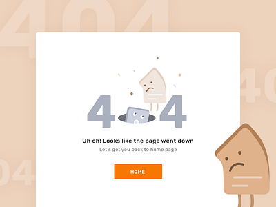

Let's face it, error messages are annoying and awfully disturbing. Whenever they appear, they remind us of a mistake. But why should the users suffer from it? Agreed, anyone can make mistakes. But at-least we’ve got to do something about it so that it's easier for users to live with it. And that's why for our Mathilda project we designed these fun error screens. They are interactive and they keep user informed about the error! Hope you like these illustration for error & empty states.