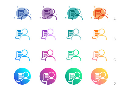
Student Icons
After some feedback I revised the icons a little so that the differentiated content on the screens was more noticeable by adding a little more space between the lines and also making it darker in color compared to the rest of the icon.
More by Ben Mettler View profile
Like

