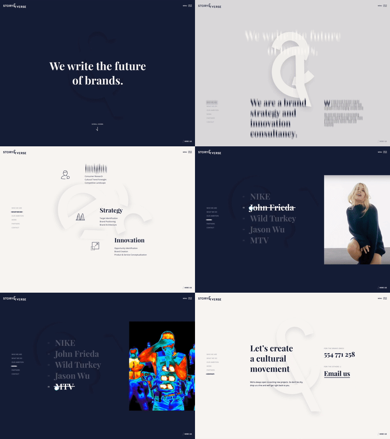
Landing page prototype
Hey, guys! We're excited to share a prototype we did for our client in January. We were given an assignment to create a very minimalistic website for a brand strategy and innovation consultancy here in NYC called Story & Verse.
Because the website had to follow the most simplistic visual style, we created a different point of focus that enriched the overall feel.
We extracted the "&" symbol from their logo and let it enforce their story as you scroll through the homepage. Once the user finishes their journey, the symbol connects and completes it's journey too.
We hope you like it!
More by Buzzworthy Studio View profile
Like


