Gava Logo + Brand Concept
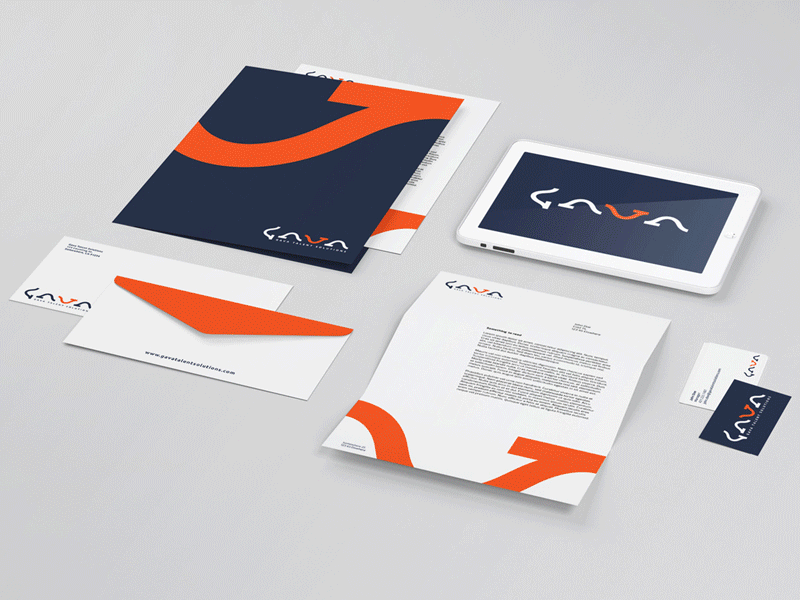
This is a rejected concept I created for a tech recruiting company named Gava Talent Solutions. It uses the same undulating mark four times to spell the word GAVA. The letter “V” is marked orange to highlight the seamless fit of that particular mark between the two “As” (just like the talent they find for various companies would be a seamless fit).
Ultimately, they decided the concept was just too unconventional for them and they went with a more subtle concept.