New Portfolio Site
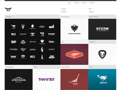
I've been working on a new site for my gertvanduinen.com
Also decided to give Fontfolio theme by @Marios Lublinski of Dessign.net a try and do all the edits live.
After many years running the old black & white one-page portfolio, without any significant updates, I got a little tired of it. More so because it gets way more visitors than I expected.
I've only added a few thumbs to see how they all work together and I'm pretty excited about it so far. Please don't pay attention to the textual content and some blurry images derived from my old site.
Any thoughts and suggestions are welcome.
Edit: I moved the social icons to the right and the navigation to the left. I still think those social icons suck big time.
More by Gert van Duinen - contact@cresk.com View profile
Services by Gert van Duinen - contact@cresk.com
Like

