Testing our Location Permissions screen
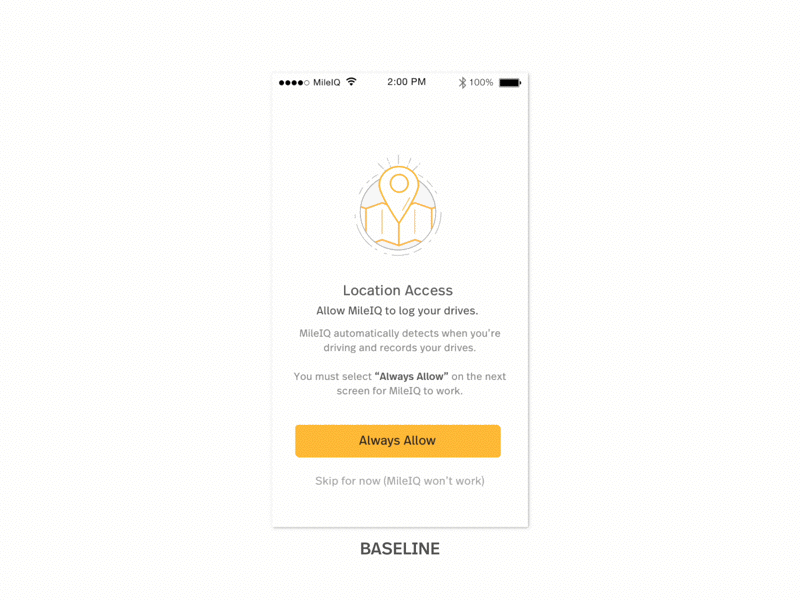
Upon revamping our onboarding experience, we saw a dropoff on the Location Permission screen, so we wanted to improve and test this particular screen.
On the left, is our original design, which was the baseline we tested against. On the right, is a range of visual explorations with the same copy. We tried designs with our illustration style, simplified UI elements from our drive cards, as well as using the modal dialog.
Result: The winning screen used the modal dialog in the design, as it primes the user to what they’d see next in the onboarding flow. Also, we believe surfacing the modal dialog and making it visually prominent that the user should tap on Always Allow, helped enforce this action.