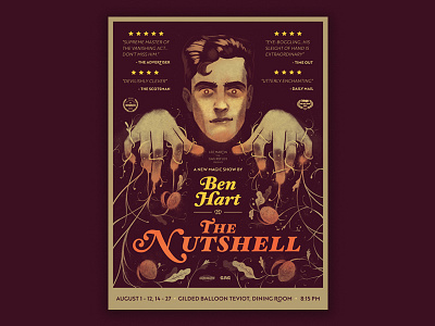
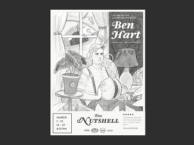
Ben Hart Poster Final
This is the final design that came out of the original sketch direction. This one was more focused on Ben Hart and creating more space for the typography to live and breath. The colors and textures were chosen to look like vintage posters and old magic prints. I hope it comes across! Very excited to see this one printed up.
You can see more on Ben Hart here: http://www.benhartmagic.com/ or here: https://twitter.com/ItsBenHart?ref_src=twsrc%5Egoogle%7Ctwcamp%5Eserp%7Ctwgr%5Eauthor
More by Logan Faerber View profile
Like

