Student Support Services
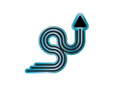
This was a logo I designed for Student Support Services. It incorporates the 3 Ss. It represents the 3 parts of the journey of a student: COME, STAY, TRANSITION. So a student begins the journal at the left, the majority of their journey is winding through the main portion of the S which just like life has many bends and turns. The arrow is for TRANSITION for the student to move onto their version of bigger and better things... moving "up" in life, so to speak. The blue was chosen because it encourages feelings of trust and calmness. Since support services offers a lot of counseling and advice I felt that it was additionally important to have a welcoming color scheme.
