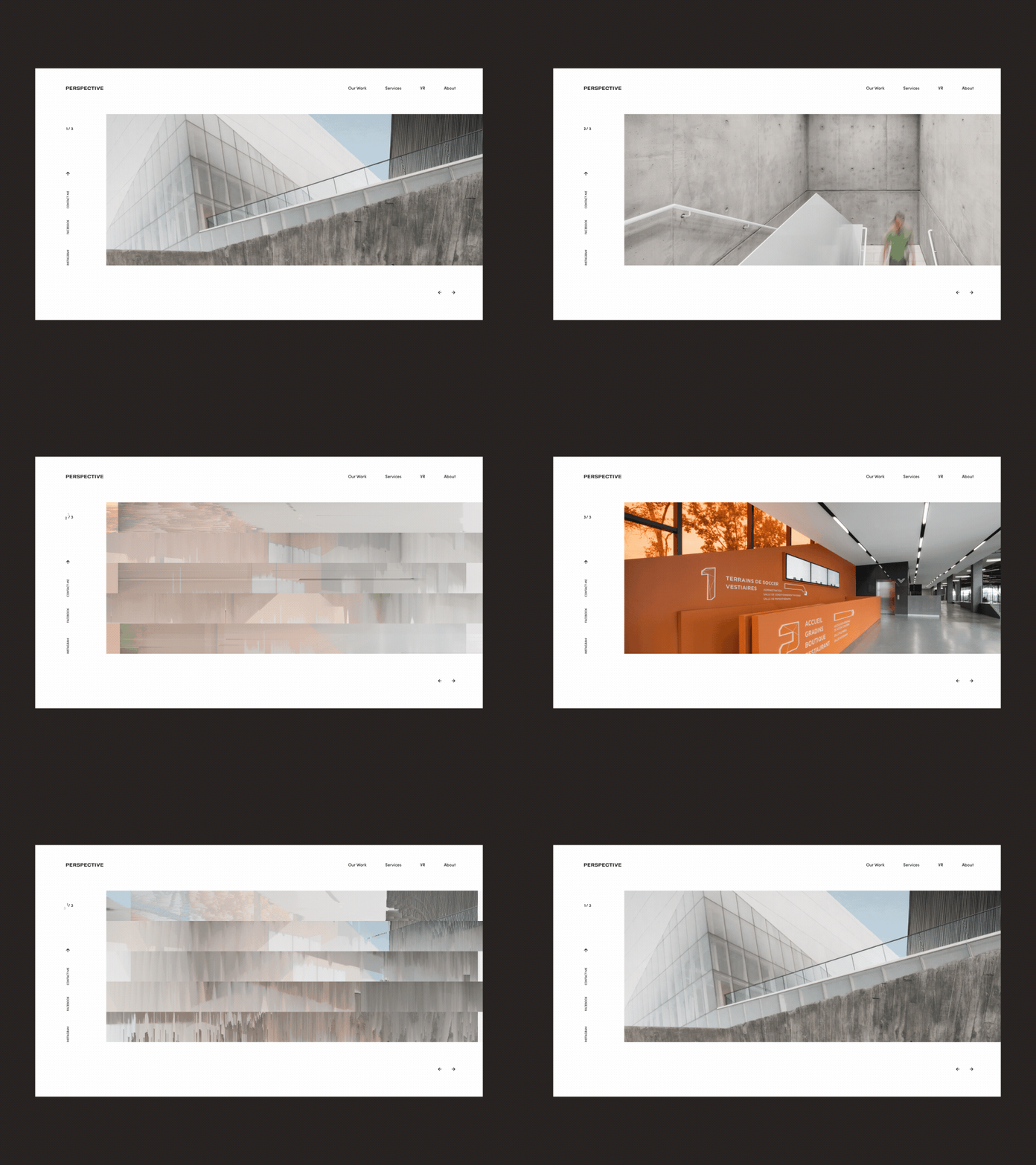
Perspective Architecture Bureau Homepage Slider Animation
Hello friends,
Glad to share with you my new work! This is the homepage slider animation for a progressive architecture bureau called Perspective. The idea behind the slider was to play with a cool geometric effect to support the overall UI concept as well as the name of this studio.
I think it came out pretty cool, didn’t it?
Eager to hear your thoughts and comments :)
Cheers!
Press "L" to appreciate it
More by Synchronized View profile
Like
