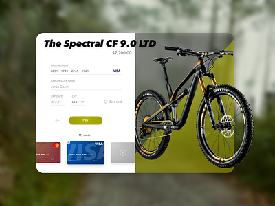
Credit Card Checkout - Daily UI-challenge 002
In my second contribution to the challenge I wanted to try and design elements that doesn’t follow the constraints of the main box.
I also wanted to design my own credit cards and visualise that the user can choose a saved card, instead of filling out the form.
I’m very satisfied with the overall result, in particular how the bike turned out.
More by Jonas Muchardt-Pind View profile
Like
