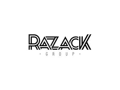
RAZACK – Branding
The final Razack logo for a client, Razack Group. The same style as the monogram – 'futuristic' and modern. More trial and error with the kerning, it started out with a loose/open kerning and as we progressed, it got tighter, we started to over lap it, and that's when we found something the client was happy with.
The final colours were black, white and a rich gold.
Feedback is always welcome, let me know what you think!
More by Liya Candace View profile
Like


