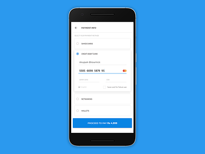
#002 Credit Card checkout
The task was to design a credit card checkout screen. I chose mobile view as for me that's more convenient during a payment process. Also, this is one of my favorite color palette.
Hope you all like it.
More by Anupam Bhowmick View profile
Like
