easyJet Mobile App – Redesign Concept – Checkout
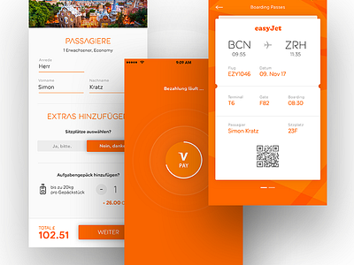

What if flight booking in easyJets mobile app was more intuitive, seamless and forward-thinking? Worked on some design explorations for an interactive concept.
—
I’m using easyJet’s mobile app since years and wish there were more user-centric and engaging designed features within the app.
Since i’m always on this mission to find new forward-thinking and alternative approaches, which make the usage more intuitive and attractive, I took some time to rethink their recently updated mobile app.
Focused on the goal to improve the user experience and suggest new solutions how easyJet’s flight booking system actually could be „easy“ to use.
I’ve been working on some design explorations the last couple of days for an (early stage) interactive concept – let me know what you think.
There's more to come in the next days. Stay tuned.
—
The easyJet Logo and Brand material is intellectual property of easyGroup.
________
👉 Looking for some collaboration? Would love to hear from you – just DM or hit me up on Twitter.
________