Tall Order, Small Budget
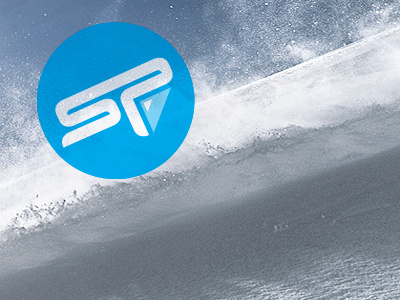
This logo was a challenge. In short, it had to appeal to two completely different audiences, while leaning towards one more than the other. The audience in which I was supposed to lean towards was snowboarders and skiers. The other was... well, I'll spare you the details.
The final logo actually includes the full client name above the "SP". I left it out for privacies sake though – as it's not really 'final' yet.
Anyway this shot is from a proof of concept ad I made. I found the placeholder photo from this amazing series. Worth checking out.
More by Kevin Richardson View profile
Like
