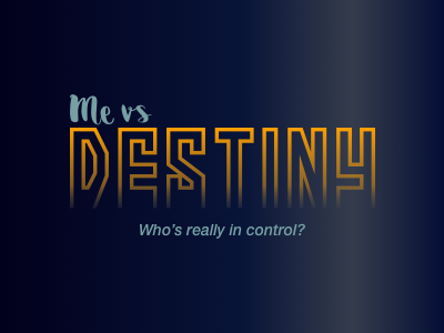
Me vs Destiny Logo
This is my logo design for a hackathon project I created. The idea was to give the user a short survey about themself and then compare their answers to what their genomic data suggests about them. I targeted a tongue-in-cheek, self-serious tone.
I wanted both the text and concept of “Me” to come off as casual and unassuming while “Destiny” should be mysterious and imposing. This dichotomy would be expressed in differing fonts and text sizes.
For "Me vs" I found a default cursive font which captured the casual tone I was targeting. For "Destiny" I ended up googling “scary fonts”, which led me to the ‘More than Human’ font.
I liked this font because it’s blockiness gives a good weight for conveying importance, while the open bottom of its lettering conveys a sense of mystery. The default font, is a bit too stabby (I found it searching “scary fonts” after all…) so I flattened the bottom of each letter and added a fade to reinforce the ‘mysterious’ aspect.
