Website for an Extreme Travel Agency
Hey there!
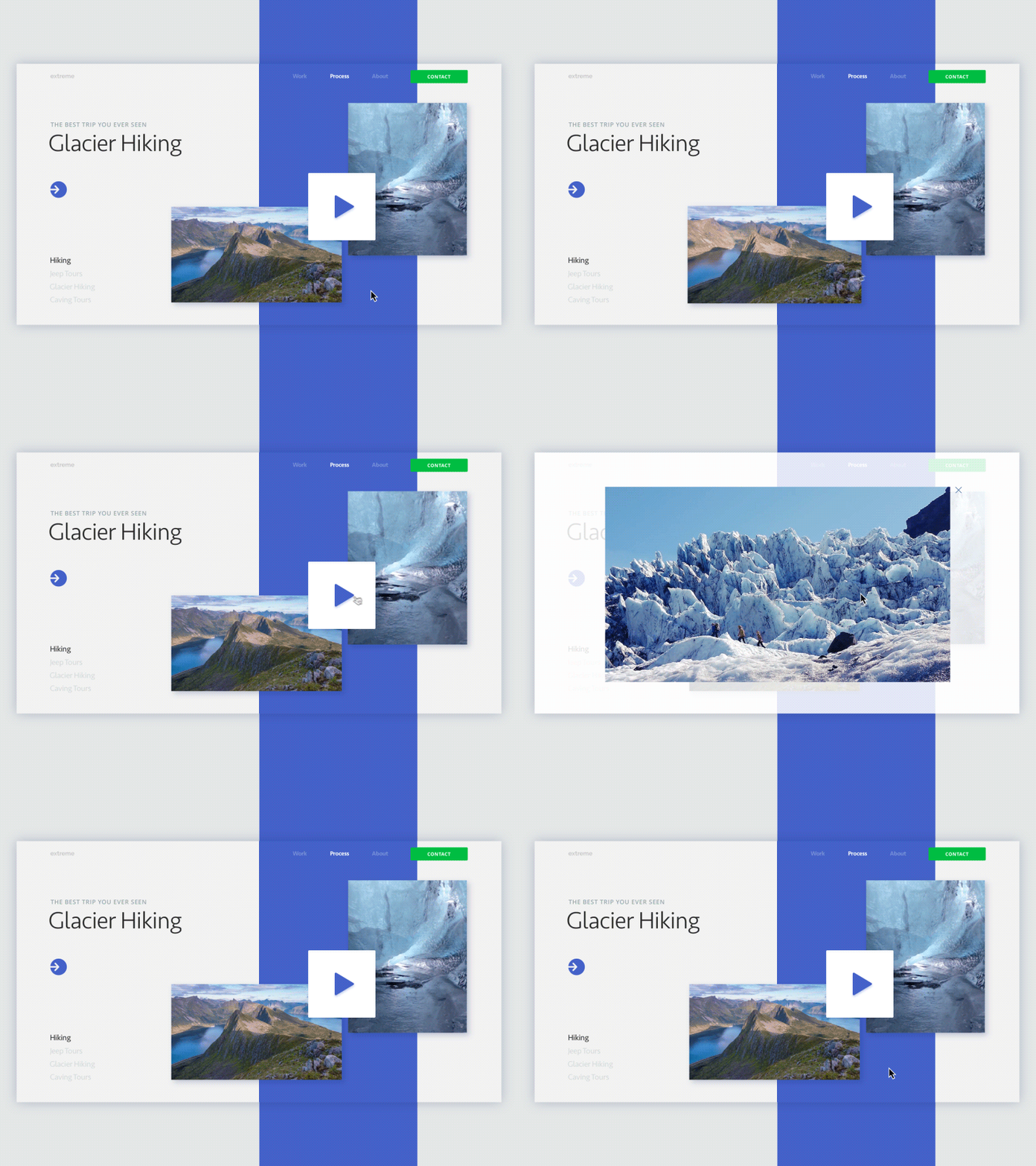
I animated the first version of the website homepage we’re creating here at Zajno for a rad travel agency that offers tours to extreme destinations. We’re pretty much enjoying working on this project cause the product is really cool. Isn't it? Or is it? Take a look and say what you think! ;)
Join our Newsletter for more inspiration!
Goals Animating the page to show how users will interact with it learning the main info about the agency and its tours. The videos you can see in the shot are not the ones that will be in the final version of the website. Our clients are still preparing the visual content for their website, including the videos that will be pretty informative showcasing all the details and key requirements for each destination.
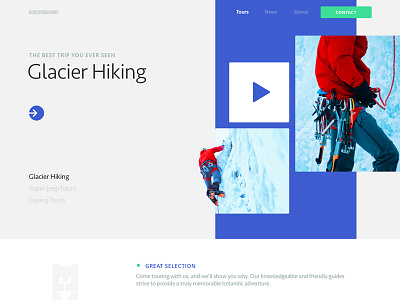
Approach On the page hero shot users will see a slider that shows pics of different extreme destinations. We thought it would be better to use gifs instead of just photos to liven up the page a bit making it look more storytelling. As one of the requirements was to apply a minimalist design strategy, it was decided to present the main info on each tour and the area by showing a video users could see without leaving the page. You can switch tours by clicking the buttons in the bottom left corner.
Results We ended up with a stylish and clean homepage design that appeals to the target audience telling a cool story about this rad travel agency. What do you think about the design? Would love to hear from you!
Press "L" to show some love!
ᗈ Join our Newsletter! ᗈ Website ᗈ TheGrid ᗈ Spotify ᗈ Twitter ᗈ Medium ᗈ Facebook ᗈ Instagram

