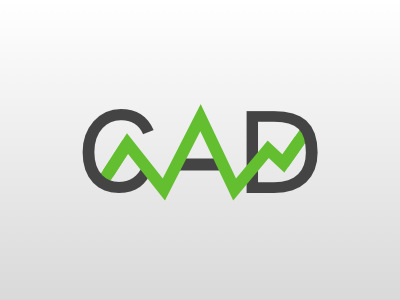
Consumer Analytics Dashboard Logo
Logo for an analytics dashboard, referred to as CAD internally
The jagged green line is meant resemble how data trends are presented within this analytics tool. The shade of green was taken directly from graphs found in CAD.
To form the A, I first spelled out "CAD" and then traced over it using vector lines to form the green arch. The black line forming the crossbar of the A is a separate layer. Once I had my arch and crossbar plotted, I created a masking layer separating the "A" of the original text from the arch and crossbar. This mask spans the entire height of the image to perfectly blend with the background gradient.
The jagged green line is actually 2 layers laid on top of each other: the first is the entire length of the shape you can see in the image, placed behind the text layer (see how it disappears behind the curves of the C and the D?). The second layer starts half way through the empty space in the C and ends in the empty space of the D. This allows the shape to cross over the front of the D and dip below the back of it. I feel this gives the logo an interesting depth
