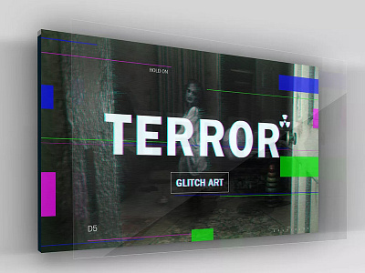
Horror "light" malfunction style poster
The theme of terror combined with the design of the fault, deliberately not to make the fault get so heavy, many of the relevant works of the design of the website are very nice to see, but personally feel that the fault is very "heavy", and may be visually very good, But looking more, some people will have uncomfortable reactions and lack of consideration of user experience! Instead, I feel that the "light" fault looks comfortable and natural and will not overswept the terror atmosphere of the background picture! Moreover, "failure" does not necessarily make it very "heavy!" "Heavy" refers to the picture is very flower, distortion, deformation ....
以恐怖为主题结合故障风设计,故意不把故障弄的那么重,很多设计网站的相关作品都是画很好看,但个人觉得把故障都弄的很“重”的,也许视觉上很不错,但看得多,有些人会有不适的反应,缺乏考虑用户体验!反而觉得"轻"故障看的舒适自然,不会过度抢走背景图片恐怖的气氛!况且“故障”并不一定要弄得很“重”!“重”指的是画面很花、扭曲、变形....等等
