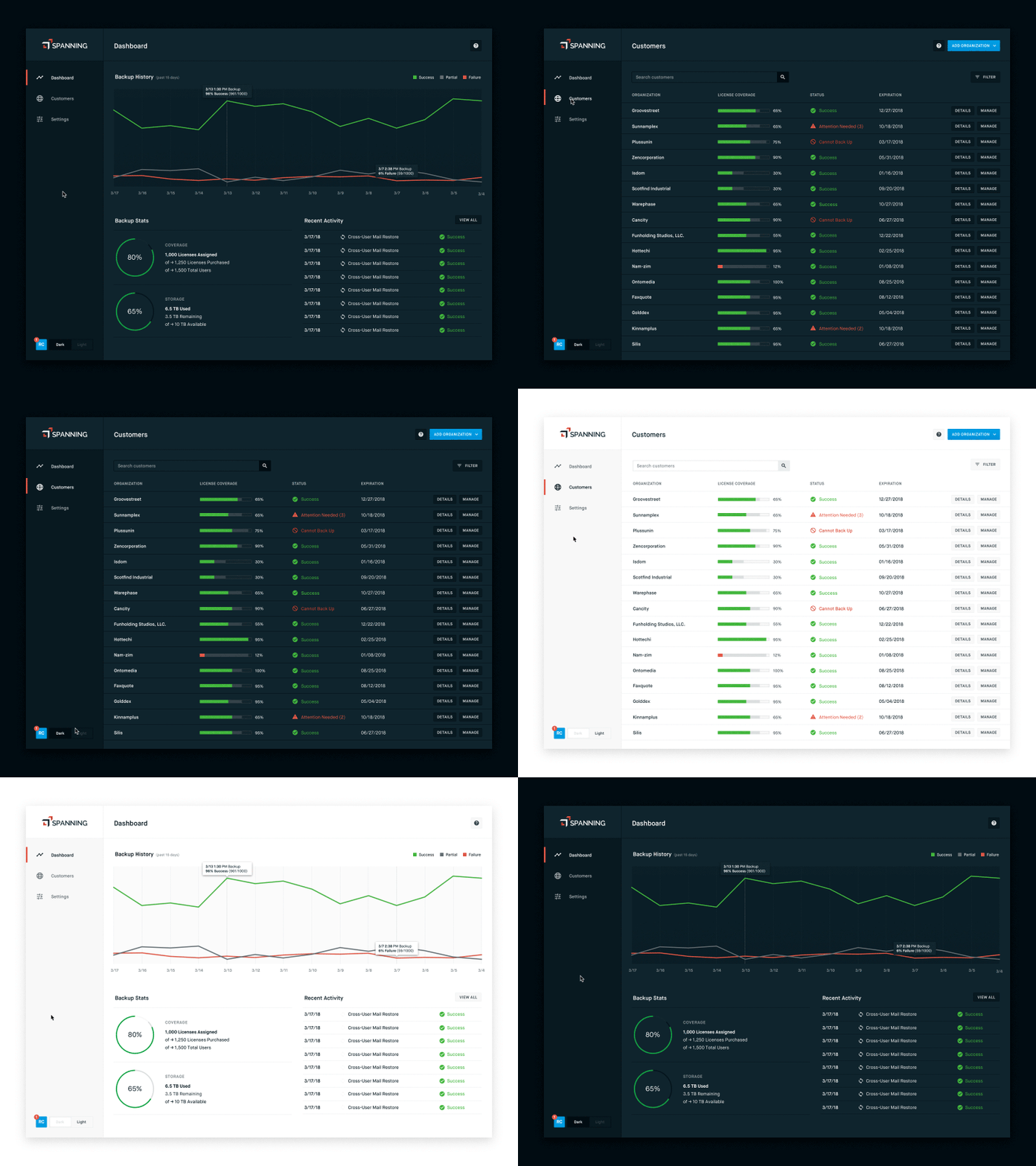
Light/Dark UI Theme Toggle
Currently working on a redesign at Spanning, unifying three disparate products into one unified UI. The new design system is incorporating a light/dark toggle. In creating the two different themes, I wanted to maintain equal levels of contrast and usability, without creating a ton of different color variables. I did so by keeping all the "color" values the same for both themes, and simply flipping the hierarchies of 9 grayscale shades. In this system, one value — "light" or "dark" — can be swapped out in the stylesheet, keeping it super lightweight.
More by Ryan David Curtis View profile
Like


