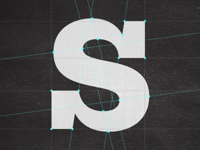
's' construction
Anybody who has ever tried to design a font knows how hard it is to get the 's' to look right. Since there are virtually no straight lines in an 's' it makes it extremely difficult to design it in a way that is optically pleasing and balanced. It shouldn't feel like it's leaning to the left or the right, but rather that it is firmly secured to the baseline.
I have tried to use a system that lines the nodes up in respect to a skewed parallel grid. In doing so it helps to ensure the curves line up right where they are best suited for the overall shape of the 's'.
(this is the 's' for one of the thicker weights of the Klinic Slab typeface that is currently in production)
See attachment for clean version.
More by Joe Prince View profile
Like

