Icon of BaiGuoTong App


This shot is from a project about portable translator named BaiGuoTong.
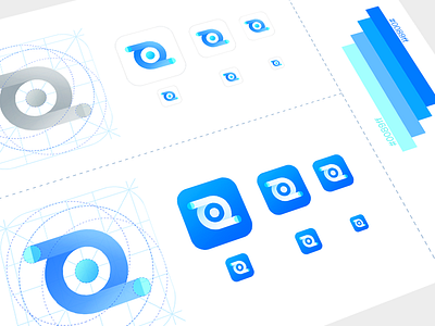
Logo mainly blue-based colors. Inspired by the outline of an eye with a global perspective, the out-edges on both sides represent exchange, means translated from one language to another, and finally, the middle sphere represents the earth.
Hope you like.