Dinty Dental Wordmark Logo
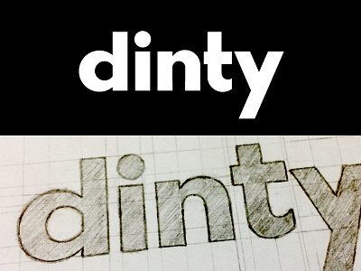


After a short Easter break, I'm back with a new wordmark logo concept for a dental company called Dinty. A simple bold mark using a sans serif font type. I'm pretty happy with the final structure of the letters, although I feel the ”t” is lacking something.
Don't forget to check out the other 3 attachments to see the original sketch and the process of creation & construction.
Daily Logo #93