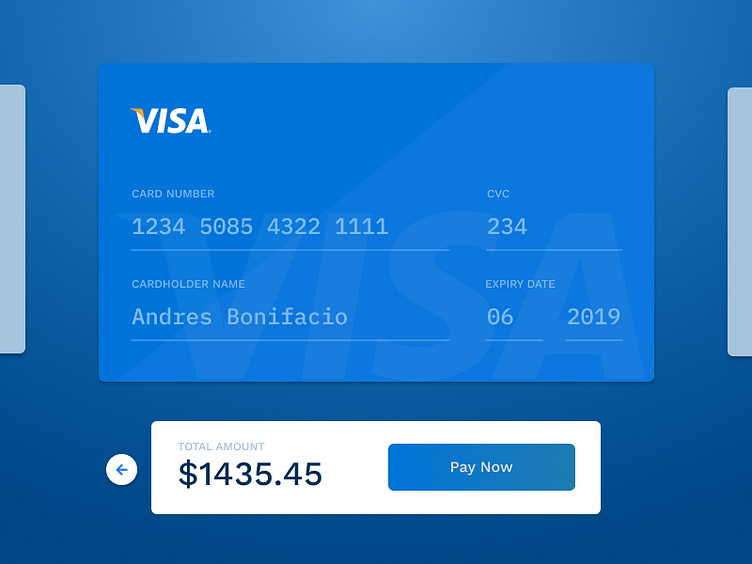
Daily UI 002 - Checkout
Day 002 for the 100 days DailyUI Challenge. A checkout form. - The 2 peeking cards on either side are meant to indicate that there are existing enrolled payment methods that you've used to fulfill payments. Does it look obvious or should I have made other choices to indicate this? - The back button beside the payment amount is supposed to cancel the payment and go back to the review step. Is it easily understandable? Or should it be a labeled button?
I'd love to hear comments, criticisms, and thoughts.
Other notes: I recently discovered, appreciated and fell in love with the pen tool! This gave me the opportunity to play around with the pen tool and masking for the subtle skeuomorphic shine on the card.
More by Ace Subido View profile
Like
