App Transitions


Hello everyone!
We have been experimenting with Invision Studio non-stop since we got access. Here, we are trying to put something together that uses familiar transitions that won't break the minds of Mango users (or our developers).
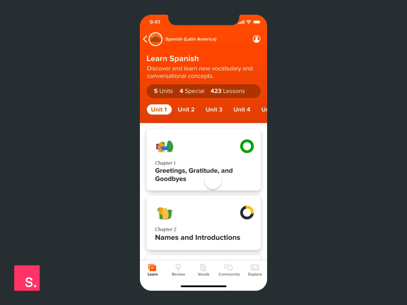
If you are familiar with our app, the orange color at the top is specific to certain languages only. For example, if you are studying Brazilian Portuguese, the orange area here would be Green.
All of these layouts work in harmony with common accessibility standards for contrast ratios. Pretty important for helping anyone learn a new language.
Check out the attachment for a closer look at each screen.
Thanks for checking it out!