Fraud UI for a Bank
Hello everyone,
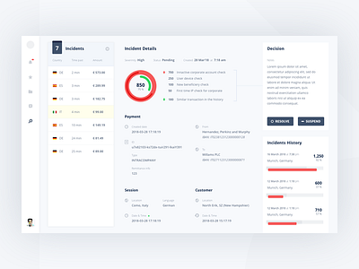
I want to share a piece of my past project from banking sphere. The tool help to analyse catched illegal transactions and make a decision for each one.
One of the main idea was to increase productivity of an responsible officer. This is why a list of incidents placed along with details view (the list is expandable into a grid — I will show you how it works later). So the officer can easily switches between different incidents’ details.
Also, making a decision if very responsible (an user can resolve illegal case by mistake). Using colors for CTA buttons in this case is not a good decision, and I decided to use neutral color along with icons. It will be interesting to know your opinion.
Thank for an attention.
More by Yura Yarokhovich View profile
Like
