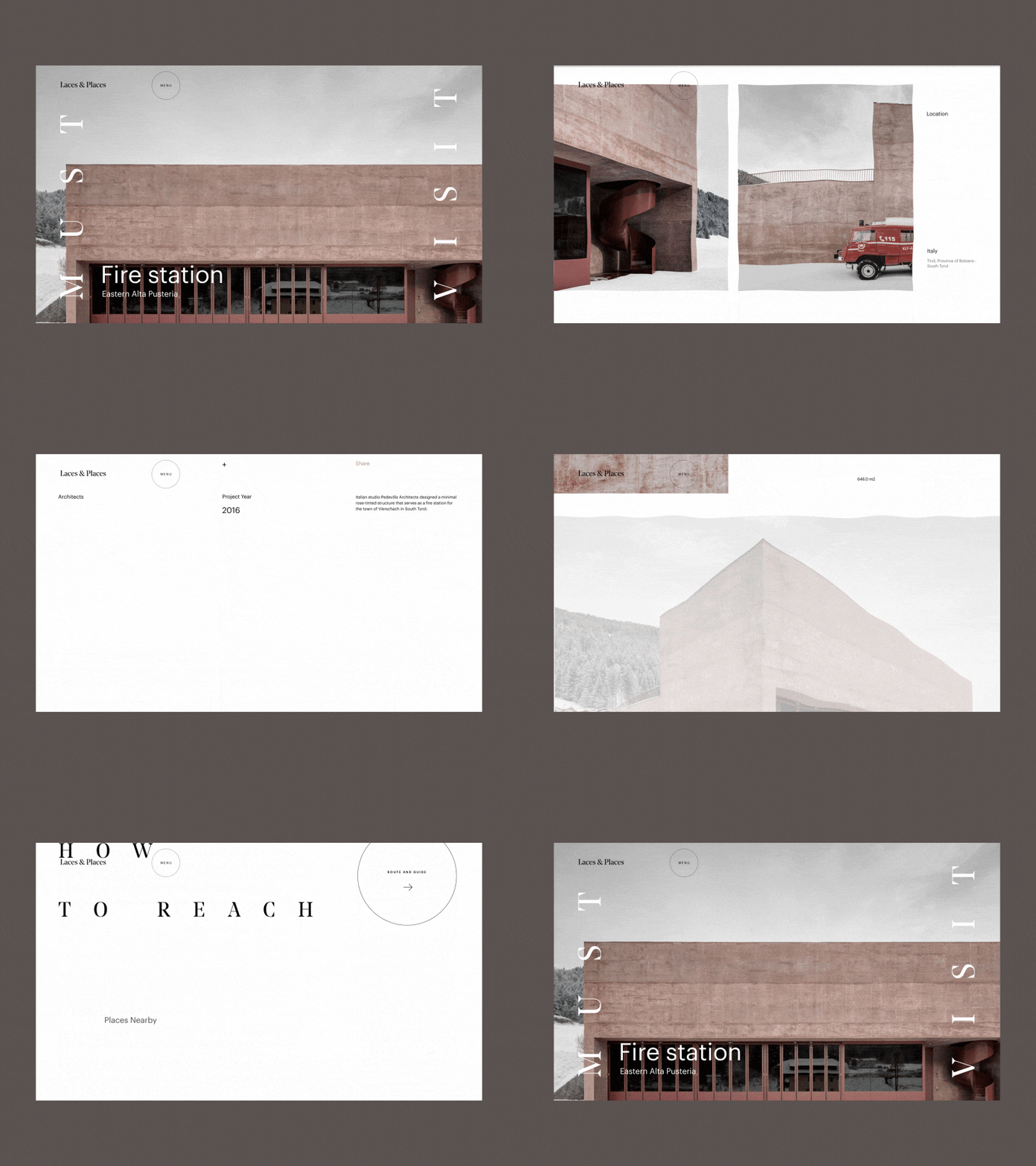
Laces & Places Travel Guide Destination Page
Hey,
This is the continuation of the animation for the destination page of the very cool travel guide project, which I’ve recently started designing. As always, the animation is the extension of the overall UI direction - pointful usage of imagery, whitespace and non-standard grid.
Eager to hear your thoughts and comments!
More to come so remember to stay tuned :)
Cheers!
Press "L" to appreciate it
More by Synchronized View profile
Like

