Portfolio Redesign
It was about time that I finally got around to redesigning my portfolio site.
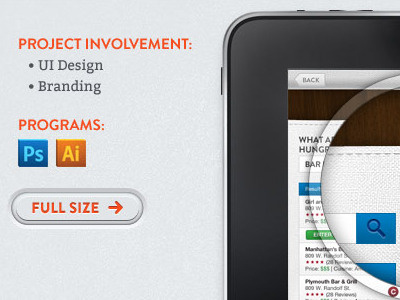
The panels will be full browser width and when clicked they will animate open to reveal the project inside.
Still not sure if I want to leave the project shots as is or have them cycle through to other shots of the project. I'm leaning towards not doing any sort of "rotator" since I am giving people the option to view the full size or visit the live site.
Are the "zoom-in bubbles" too much? I wanted to show the details on the small shots before the visitor would click the full size or view site buttons
Full shots:
Screenshot 1 | Screenshot 2 | Screenshot 3
More by Anthony Fonte View profile
Like
