Redesign | LinkedIn People Page

Sample work from redesign exercise I did this weekend.
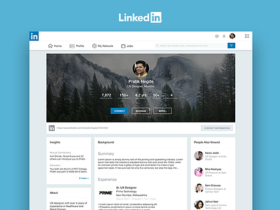
It is a Linked in Page of a user who is not in your connection.
Objective of the redesign is to make things easily scannable and accessible i.e. improve usability of the page.
When you compare, you can notice:
1. The layout is cleaner and minimal. Colors used only where necessary
2. All important and wanted information is upright. Rest are in options and profile
3. Four main sections
- Main profile (top)
- About section (bottom left)
- Related content section (bottom right)
- Background section that has endless scroll while other sections will stick after they reach end of content
4. There is a search bar to which you can apply advance filters before running the search to get the most suited result
5. Once the top section is scrolled, it will form a similar card like about section and stick to left top stacked above the about section. The background section comes in centre and Related section remains on the right.
