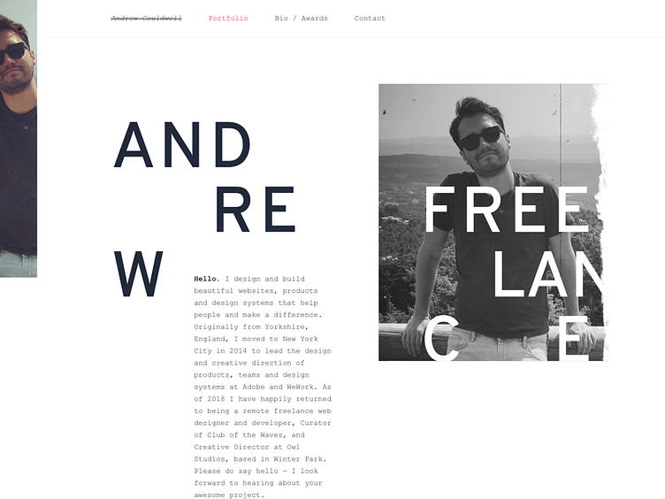
Portfolio refresh
I have returned to freelance, after 3 years locked in full-time employment. My current portfolio site is very safe and reserved, reflective of my hiatus working in-house at corporate companies. But, I'm realising now isn't true to my style, personality, or the work I want to do. Especially now I'm back 'out there' and picking the work I 'want' to do.
In the 3 months since leaving full-time work, I've enjoyed relaxing, de-stressing, experimenting and re-discovering my love for design. This shot is an experiment in finding a personal style I'm happy with, for this new chapter. It's a little whacky. David Carson has long been a big inspiration for me, so I'm channelling some of that alternative type layout and grunge while staying true to my somewhat clean, asymmetrical grid, and lots of whitespace style I'm realising I love.
I like the direction it's heading.
I'm still working on this. I'll build it in the coming weeks.
