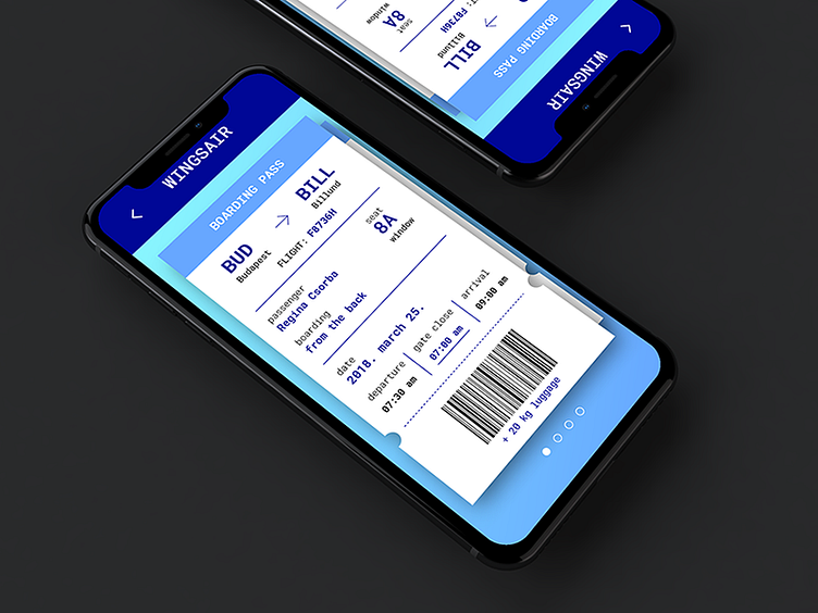
Boarding Pass design - UI challenge
Regina Csorba had a vision for a unique look for a boarding pass design. She used rather unconventional colour combinations and fonts during this UI challenge. She placed all the important information such as origin, destination, seat number, flight number, etc. in a way that it is easy to read, logically placed and eye-catching.
More by Webabstract View profile
Like
