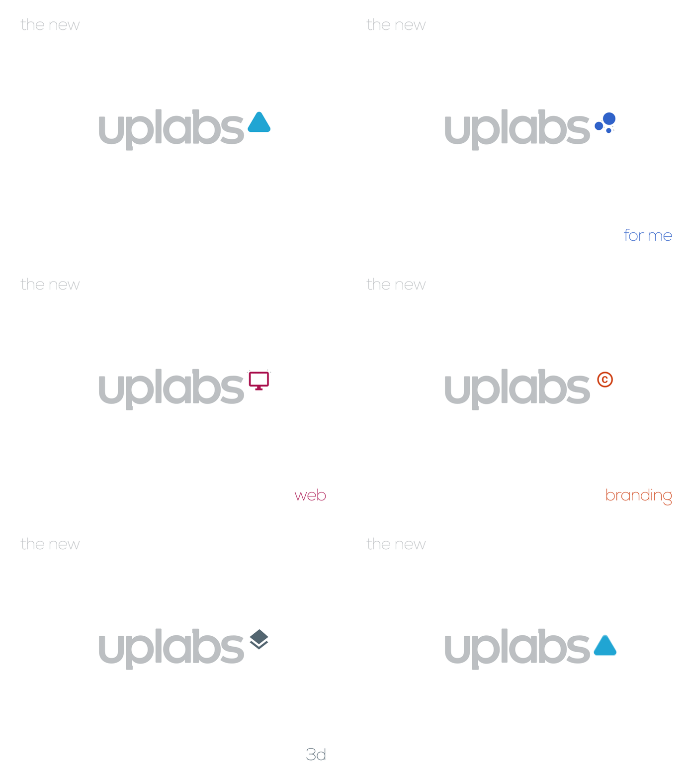
The new uplabs▵
Here's my concept for the new uplabs brand identity.
Go upvote please : https://www.uplabs.com/posts/the-new-uplabs
The logo focuses on simplicity while showcasing refinement with custom lettering and potential scalability as seen in the animation concept.
With details like the small slabs on the p and b letters, overall low verticals for balance and personality.
This opens the way for the blue "upvote / upload" arrow that now becomes uplabs's shape to own!
I feel this gives uplabs all the necessary ingredients to establish itself as a major community #uplabs▵
I had lot's of fun crafting this and hope you'll like it ;)
More by Gabriel Faucon - FIF7Y View profile
Like
