Ocataco Rebound
Hey TJ, The final logo was actually hand drawn.
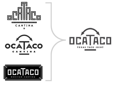
The client first came to us wanting a logo that look like a Mayan step pyramid. We came back with that and two additional logos.
He liked the arrow on the second for the reference to the palindrome (A word that reads the same backward as forward). That and it makes a taco shape. He also liked the hand drawn type in the third. So, we ended up with final logo being a hybrid of the two.
More by Nosh Creative View profile
Like

