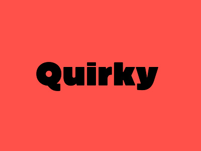
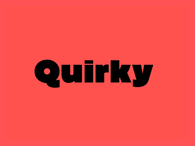
Graúna — Quirky
Curves got sharpened, but edges got softened.
Doesn't quite look like it, but a lot of things changed during the three years that separate these shots. The initial idea was to produce a revival of Block Heavy, removing the ‘rough’ texture from its outline. In the early stages of its development, however, I realized that a lot of its quirkiness is only possible precisely because of the ‘rough’ texture we were trying to remove. That way, we started going further and further away from the original model, and thinking about the typeface in its own terms, resulting in an impactful yet friendly sans serif, ideal for logos and short titles.
http://typeoca.com/grauna/promo/
https://www.youworkforthem.com/font/T8969/grauna
https://www.myfonts.com/fonts/typeoca/grauna/
https://www.behance.net/gallery/64011935/GRAUNA-Typeface

