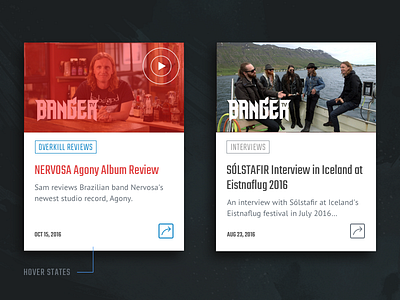
UI Cards - Design -> Buildout
Bringing height consistency amongst content of varying lengths was an interesting problem to solve. In this scenario, the priority is to include the entire video title on the card (hence the use of a more condensed type solution).
My initial idea was to allow the content to determine the height of each individual card, à la a Pinterest board flow. From a dev budget standpoint, however, this wasn't feasible within the time and budgetary constraints.
Sometimes we've got to design the best possible user experience within any number of constraints. In the perfect world, every first pass and dream solution would be the final solution. But this solution exists in real life and represents the line we tow as designers in real-world client/agency settings.
Real-life hover state interactions also attached. :)


