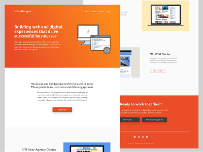
VP-Designs Website Layout V4
Still laying out the studio website, I've been reworking a bit lately and I'm liking this layout much better. Better use of space and color. I like having the white and grey in the middle and the works spaced out. It would require more work to fill in the description text but would visually be worth it.
Any criticisms are appreciated.
More by Tori Pugh View profile
Like


