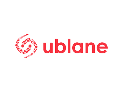
Ublane Logo - Pop up stores platform
Hey guys, 😁
This is a logo I made more than 2 years ago for a pop up stores platform company based in France.
The goal is to put in relation shop owners and new companies want to launch their activity on the pop up store concept.
The 'U' represented by the first group of points on the left side of the logo means 'Ublaners', the shop owners. Because without them, there is no pop up stores.
Then, the 'S' is represented in negative space. This is for the 'Shiners', people who want to launch their activity. They are the Stars to shine.
Finally, the 'C' (upside down) represented on the right side of the logo means the 'Consumers'.
The points are assimilated to comets. They constitute the community and the Ublane universe.
And the rounding on the letters make the typography more friendly and dynamic.
Have fun! 🚀


