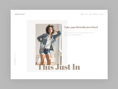
Daily UI challenge #3 - Landing page
I use one of my favourite topic, fashion, as my theme of Daily UI #3 challenge. Off the grid, text overlapping, lot of white space has been used to give a sense of elegance and freshness.
More by Ernest Chan View profile
Like

