Add just enough animation
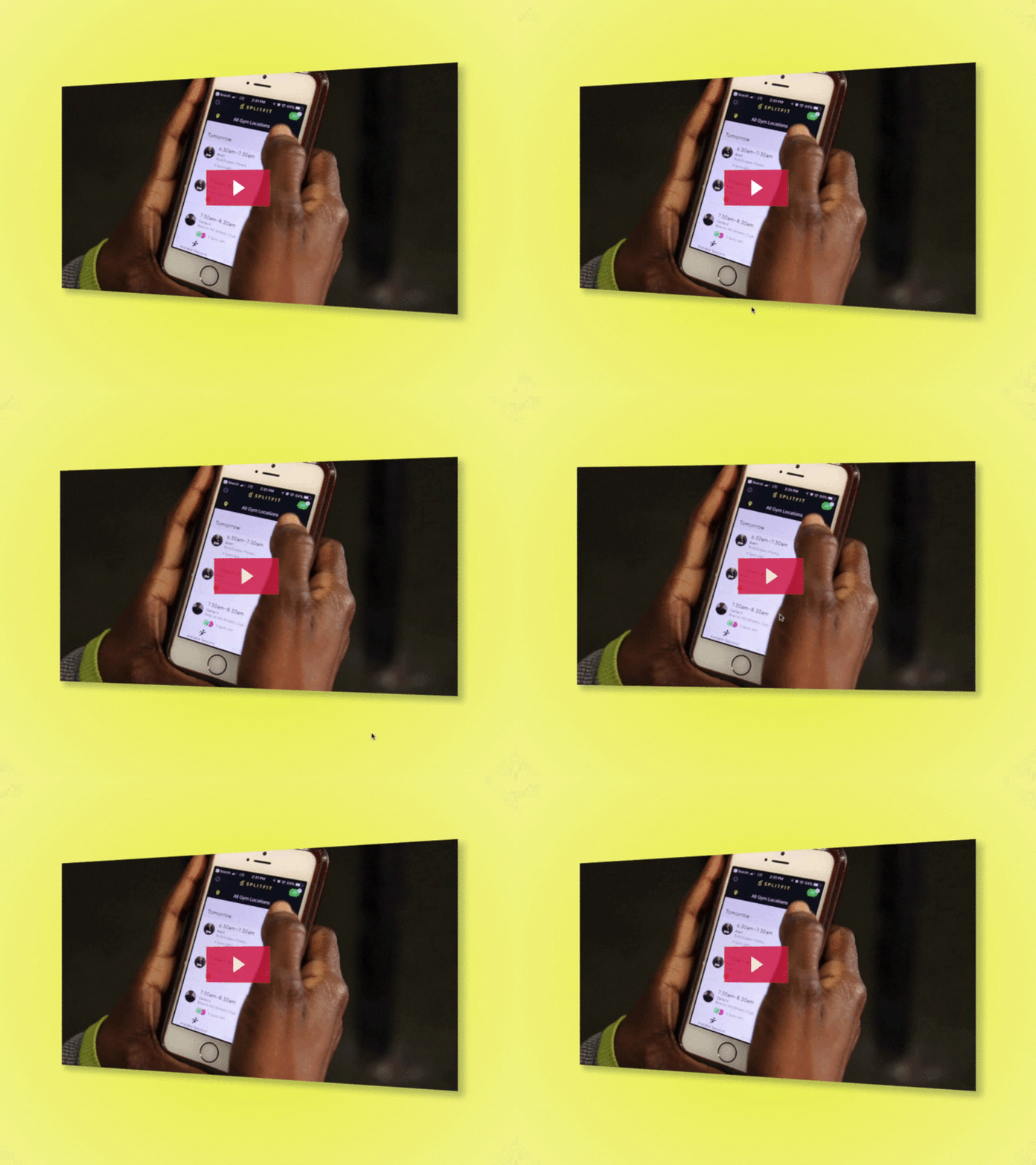
@Vendela and I just redesigned and implemented the hero portion of thoughtbot's case study for Splitfit.
We made it "delightful" by using this swivel animation as an affordance on the promo vid. The key here is that the animation is purposeful. The next time you're out to animate something take a step back and ask yourself what purpose it serves. *Full pixels attached*
Shout out to @Ryan Coughlin for his first iteration of the case study
---
Hire thoughtbot
Looking for a dedicated product team to validate, design, build, and grow your product? Visit our website to learn about our team and our process.
Join our team
Looking to join a team of expert designers and developers working on challenging products in a sustainable environment? Check out our open positions.


