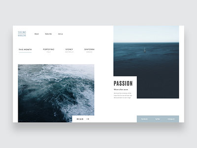
Sailing Magazine ~ Landing Page
This time I'm experimenting with rects and images*.
I took inspiration from nordic design and its minimalism because I like the way they can communicate order and simplicity using white background spaces.
Next week I will upload other visual experiments.
See you on the playground!
*by Unsplash ;-)
More by Alberto Bianchini View profile
Like
