Color Changes

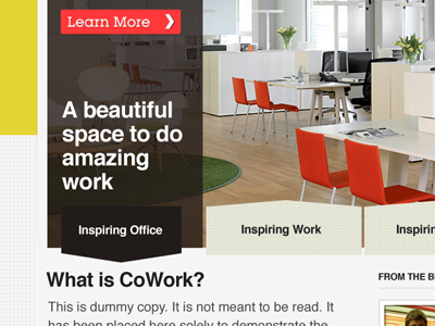
I'm not a fan of the yellow color and thought it may be cool to change up the color scheme a bit to lighten the whole thing up. As is, it feels a bit drab, even though you're using yellow, which is usually meant to brighten things up. Also, I thought bringing some of the environment from the image into the site would be kind of neat. Sort of reinforces the cleanness of the workspace. I imagine you're probably using a stock photo for the office space, but I wanted to at least show you how I would tie it together. Here's a link to the full rebound.