Dribble? I love it!
Hello Dribble! I'm so happy to be part of this community!
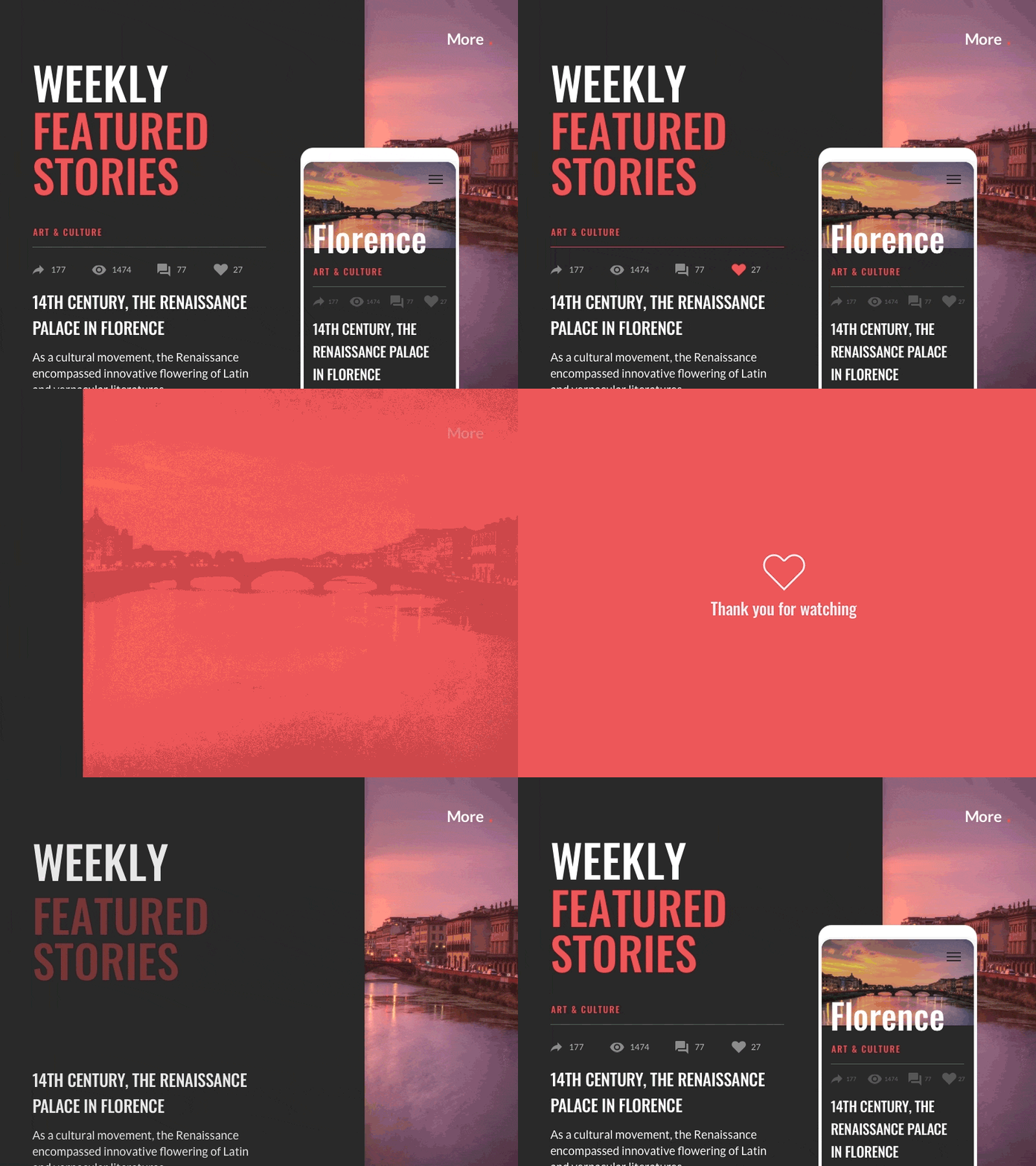
Most of the interactions with icons are limited to basic effects like hover and pressed. Here is an example of what I think is more effective: each element should be treated as unique, to give the user a feeling of immersion. Design in Sketch, animated in Principle
//Chunking Why do we tend to group all the icons together? If we combine information into a limited number of units or chunks (icons are separated from the copy, the title is easily recognizable, etc.) the information is easier to process and remember.\
//Pro tip for Sketch If you change idea about your colour palette try Sketch Replace Colour, available on Github. It allows you to replace hues to change families of colour in one go.
Follow me, new suggestions and designs are coming! Don't forget to support my work pressing L, to show some ❤️
