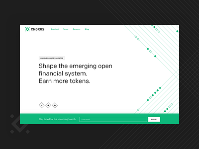
Chorus - Landing exploration V2
Alternative UI exploration on a temporary version of the landing page for Chorus. Tried a full clean white approach here and I have to admit that I'm starting to love it and prefer it over the green one!
More by Freaks & Dreamers View profile
Like

