Taskbar Scrolling - Interaction Design
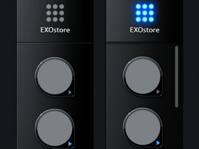
This shot represents an issue we solved with a little interaction design.
On the taskbar on the left you see the placeholders for active/open apps. The problem was, there is only so much vertical space on the taskbar because the bottom of this vertical taskbar also has a button like the EXOstore button. And both buttons are flushed (at the same height) with the taskbar.
The simple solution would have been to just make the taskbar area always recessed. But that wouldn't look clean and sleek. So the solution was to:
If you TAP and HOLD the taskbar or the moment you begin to SWIPE vertically, the taskbar instantly recesses and the apps now drop below the height of the buttons, so they are free to travel under the buttons which gives you infinite room to have active/open apps.
UPDATE: I attached a graphic that illustrates the problem and the solution.
© EXOPC. All Rights Reserved.
You can view our website at: http://www.theskinsfactory.com

