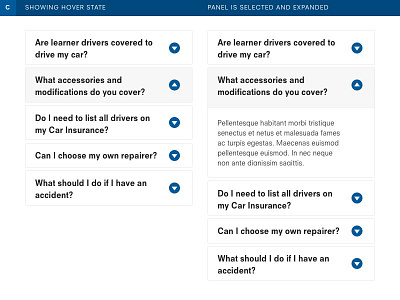
Accordion Design Concept - C
This option explores using a down arrow icon with a circle that aims to act as a primary interactive element.
Although the light grey background is a subtle hover and selected visual treatment, the bold weight of type continues to cause readability difficulty. It could be the harshness that this conveys as your eye scans through it all.
More by Mark Cabritit View profile
Like
