Thumb Reachable Design for IPAD
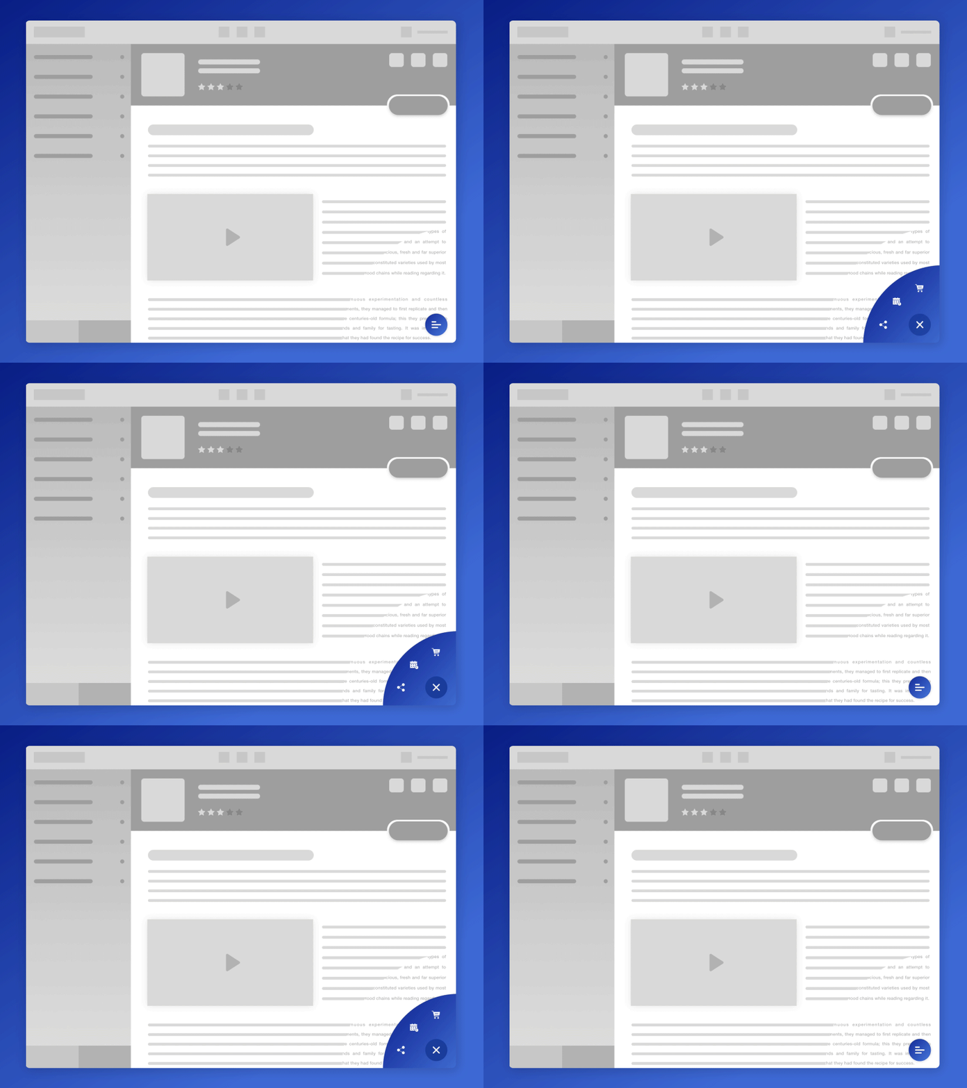
The other day I was having a feedback meeting with the client and he could not quite understand from the wireframes that how the floating thumb reachable buttons would work/look like so I made this.
This application has tons of items and buttons to select from along with multiple navigation option so I used the thumb reachable areas to hold the most frequent and important action items that a user needs. All this, after a thorough user and app research.
The bottom-left side contains the buttons to navigate through a the list of food outlets back and fourth where as the bottom-right side contains a floating button which provides further important options.
More by Saleh Riaz Qureshi View profile
Like
